Heuristic Reviews: How Experts Anticipate Usability Problems (Part 1)

Heuristic evaluations, or expert reviews, are sometimes overlooked because they don’t involve recruited participants and, as the thinking goes, they aren’t as “valid” as testing with actual users. However, as with the many other methods available in a UX researcher’s toolbox, heuristic reviews have their place and purpose, and can often be a good first step toward a holistic research solution.
“When conducted by an experienced UX professional, heuristic evaluations can often catch issues that are missed by others.”
Broadly, a heuristic evaluation is a review method that checks the system for compliance to accepted usability principles. When conducted by an experienced UX professional, these quick reviews can often catch issues that are missed by others. Once problems have been identified, the researcher can work with the product team to discuss possible resolutions before going forward. This often improves efficiency and effectiveness, because subsequent user-based testing can then focus on uncovering other problems or serve as a point of validation for the issues identified in the expert review.
To illustrate the usefulness of heuristic evaluations and understand how incorporating them into your research plans can improve results, here is the first article of a two-part series on simple evaluations conducted on common, everyday products.
Heater with a hard-to-read display
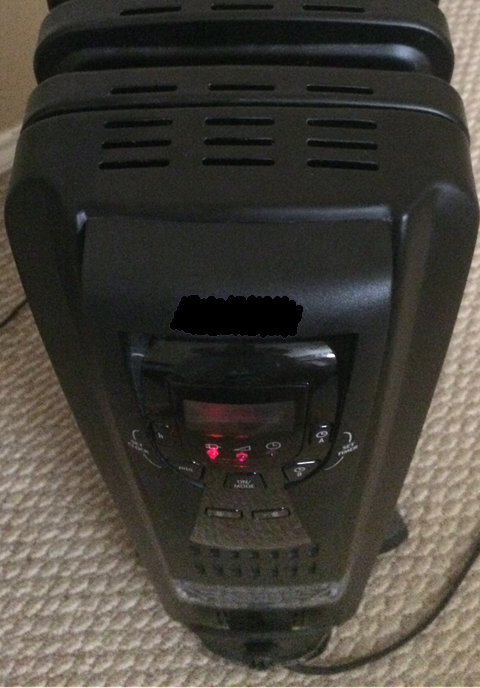
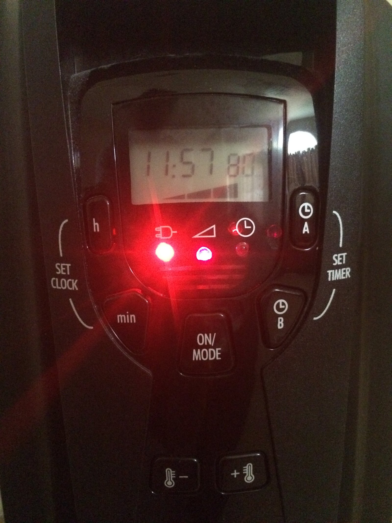
Our first example involves the user interface for a portable electric space heater, a fairly common appliance in many homes. This model features an LCD screen that displays time and temperature settings, as well as several LEDs that indicate current settings. Users can interact with the appliance through surrounding buttons or a remote. Can you detect a usability problem with this design?

At first glance, the control panel and display seem fairly simple to use, especially considering that the few available options appear properly labelled. However, one big problem that experts would recognize from researching similar devices is the difficulty that users might encounter when using this display in dim lighting (think of using this heater in your bedroom at night).
First, the LCD screen is not illuminated, which makes it incredibly hard to read in low-light settings. This becomes a usability problem when users want to adjust the thermostat, because the only place where the temperature is shown is on the LCD screen.
Even with typical overhead lighting, the recessed display and its upright, forward-facing position make it hard to read the display from angles other than the front. This means that users have to crouch, bend down, or otherwise lower themselves to get the display at eye-level, because the heater is only as tall as the user’s thighs when placed on the floor.

Because the display is hard to read, users who do not carefully observe the screen may be confused by the heater’s operation if they unintentionally set the thermostat lower than current room temperature. In this scenario, users who turn on the heater with this improper (and illegible) setting may be confused to find the heater turning off within a few seconds without any apparent explanation.
It becomes clear in this situation that the underlying cause of this problem is not properly accounting for human limitations in reading LCD screens in low light.
A second usability observation involves the use of red, yellow, and green LEDs to signify high, medium, and low power settings. Using these colors is confusing because they are commonly associated with errors or severity levels rather than temperature. UX experts are sensitive to the impact that these strong associations can have on a users’ experience, and the frustrating mistakes that can ensue as a result of their misuse.
Additionally, to the casual user, there may also be some confusion around how the power setting works in combination with the thermostat setting. For instance, it is unclear what will happen if, say, a temperature of 75°F is set on the LCD screen, and the green (low) LED light next to the power icon is also illuminated. There is little to suggest whether the LEDs signify how much power the appliance uses (and subsequently how fast it heats up to the desired temperature), or if the LEDs indicate preset temperature settings, or something else.
How heuristic reviews direct future research
Although I want to make it clear that determining the correct way to resolvethese usability issues would likely require user testing and a careful consideration of research, technical, and business priorities, UX experts can help identify the issues up front before you are too far along in your design process to feasibly change anything. Given the breadth of expertise offered by UX professionals, even something as quick as a heuristic evaluation can go a long way in catching frustrating issues that may have otherwise turned users away from your product in a crowded marketplace.
Join us next time for the concluding post in this two-part series on Heuristic Evaluations. We will take a look at usability design flaws of a car dash cam. Until then, please share with us any usability failures or success that you have encountered!
At Human Interfaces, an expert team of UX professionals work with clients from a variety of industries to develop custom research solutions for any UX challenge. If you need help from a full-service UX research consultancy for a study, recruitment, or facility rental, visit our website, send us an email, or connect with us through LinkedIn.


