Heuristic Reviews: How Experts Anticipate Usability Problems (Part 2)

In our recent post, we introduced the idea of incorporating heuristic evaluations in the product development cycle as part of a more well-rounded approach to performing research. In the first article of this two-part post, we discussed some usability problems with a portable electric space heater and pointed out how these issues could have been caught and resolved before the product was released.
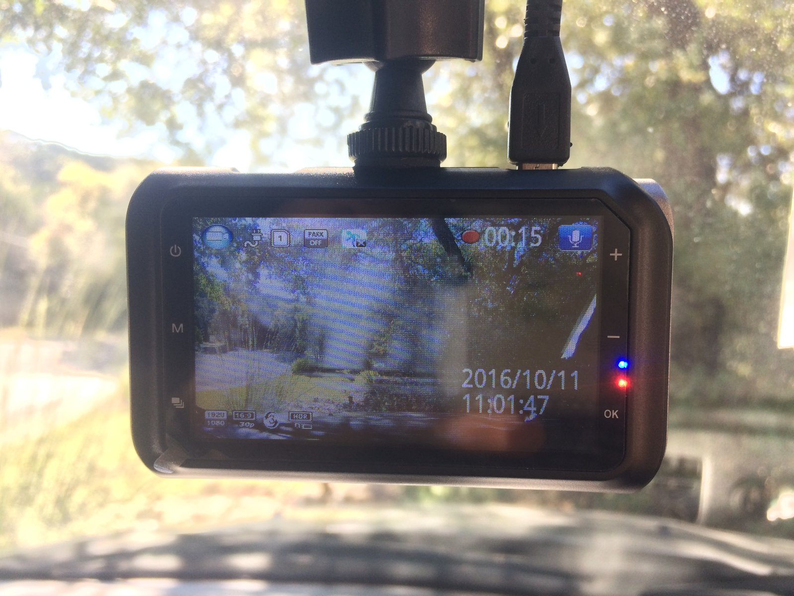
This week, we turn our attention to another consumer product – a car dash cam with a built-in display and physical buttons on the left and right sides of the device – and see how a hard-to-use interface can stand in the way of a good user experience.
Confusing dash cam controls
High-tech electronics are inherently more complex than electrical home appliances. However, if designed properly, they don’t necessarily have to be hard to use. The main usability challenge for such devices is that navigating through the available commands and options can be confusing, but proper usability testing can greatly improve the user’s experience. Let’s dive into some of the usability considerations for this device…
Although the six buttons on the device are labeled with icons, it quickly becomes apparent that the options they enable are seemingly arbitrary. For example, when accessed outside a menu tree:
- The “+” button toggles between enabling and disabling audio recording;
- The “–” button apparently does nothing, unless the dash cam is currently recording, in which case it toggles between enabling and disabling record-while-parked mode;
- The “OK” button appears to start and stop recordings;
- The “M” button shows a list of saved files; and
- The “stack” button shows the device settings menu.
The only button that made sense was the power button (top left), which turned the device on or off. As for the others, the unintuitive button functions and questionable icon choices are puzzling. Also consider that those same buttons can have totally different functions depending on what mode the dash cam is in; for example, when the cam is not recording, the “stack” button accesses device settings. However, when in recording mode the same button tags the recording as an “event” to prevent deletion. What is going on here? Why did the designers assign these multiple functions and choose these confusing icons?
Before we precede, a point on the role of manuals: one may argue that the onus is on users to read the manual before expecting to know how to operate modern devices with multiple features, and that such complexity is excusable if addressed in a manual. However, that simply shouldn’t be the case. Even with complex devices, good usability can and should make it easy enough for novice users to figure out and use most of a product’s core features without resorting to referencing lengthy documentation.
With that said, a quick examination of the product manual sheds some light on the button functions: “M” stands for “Mode”, whereas the “stack” button is supposed to represent “menu” (there is also the question of the appropriateness of this icon to signify “menu”). However, even knowing this, using the functions associated with those buttons isn’t any easier.
To be clear, there are more features that this dash cam can do and are accessible through the six buttons that we won’t discuss so that we can keep the discussion manageable. However, it suffices to say that the underlying problem here is the overlapping functions and unintuitive mapping associated with the buttons.
In the case of this dash cam, this illustrates that what could have been an easy-to-use device can be a perplexing one if not properly designed and tested to account for the user experience. Again, a trained UX professional could have uncovered these issues and recommended possible fixes.
Usability matters
“Bad design can be easily caught and rectified with expert reviews and people-centered usability testing”
Usability testing does not need to be complicated or hard to perform. In fact, bad design can be easily caught and rectified with expert reviews and people-centered usability testing before the products are released. This is far easier and better than trying to handle poor product reception, bad reviews, and post-hoc fixes after product release. In our two examples of the space heater and the dash cam, the products were technically sound and worked fine, except for the noticeable user interface flaws.
Unfortunately, without adequate testing, products that provide a poor user experience and are frustrating to use and enjoy can spell failure in the marketplace. In today’s competitive environment, that’s just something a prudent organization cannot afford to have happen.
Have you encountered usability issues in everyday products that could have – and should have – been caught and fixed? Share your stories, experiences, and insights with us.
At Human Interfaces, an expert team of UX professionals work with clients from a variety of industries to develop custom research solutions for any UX challenge. If you need help from a full-service UX research consultancy for a study, recruitment, or facility rental, visit our website, send us an email, or connect with us through LinkedIn.


